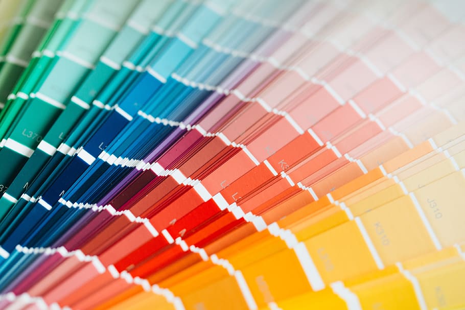
If you’ve ever struggled with web design before, chances are you’ve stumbled into this exact same question – what colors do I use for my website??

The color palette of a website, whether it be business or personal or otherwise, is a seemingly innocuous, and therefore often tragically dismissed, aspect of web design. More often than not, businesses usually slap whatever color they feel works on their website and call it a day, confident that their decision wouldn’t make that much of a difference in the long run. But contrary to popular belief, blends of colors can have a very implicit – yet no less significant – psychological impact on those who view them and can actually make all the difference between whether a website is effective or not.
But establishing the importance of color to web design is only the beginning of a solution. After all, knowing colors is important is one thing – actually finding a color that works effectively for your brand and your business is something else entirely. So when it comes down to it, what color, exactly, should you choose for your website?
While your decision of colors is very much dependent on certain factors (e.g. the tone and mood you’re business wants to convey, the aim of your business website, etc.), here are a few popular colors often used in websites that may give you some ideas.
1. Shades of Blue
From Tumblr to Twitter to Facebook, from Skype to PayPal to Linkedin – just thinking about it, it’s clearly no secret that blue is among one of the most popular colors for web design.
The sheer prevalence of blue as a website design color is pretty evident in your day-to-day internet surfing. With so many social media platforms, business websites, and
<ahref= “https://jumixdesign.com/”>website design penang</a> and all across the world using the color, it almost seems that the digital world is wholly awash in a sea of blue. But before you immediately leap onto the bandwagon and paint every single portion of your website in some blue shade, it’s important to first understand why blue is so often used – to ensure that you’re using a fitting color for your own business brand.
Much like with most of the colors here, the popularity of blue in web design has to do with the psychology of colors – i.e. how different colors may connote different things and therefore instill different feelings and energies in those who view them. Blue has often been associated with loyalty, security, and innovation – it promotes feelings of trust between the website and it’s viewer, as a mostly calm tone reminiscent of natural things like the sea and sky. Therefore, if you want to instill more calm and trustworthy feelings in your viewer, perhaps you can consider adding a dash of blue somewhere in your website. But if you’re looking for more of a wow-factor, or a spark of excitement? Maybe skip out on blue – and look to the second color on this list instead!
2. Shades of Red
From the calm to the excitable, we move on to shades of red for a possible website palette. Another common web design color prominently used in platforms like YouTube and Pinterest, red can be considered blue’s polar opposite – rather than instilling feelings of calmness and tranquility, red is a far more striking color that promotes excitement and boldness. Red is a color that often screams out to be heard, and is therefore a more fitting alternative for websites that specialize in entertainment, healthcare or emergency services, and other things that require a striking, bold look. If you want to draw your viewer’s eyes, go for red – the color of vibrancy, of direction, of a bull’s eye to draw one’s gaze.
But again, remember – red is blue’s opposite. So if your brand connotes softer, calmer feelings, it’s better to stick with blue and forgo striking reds – lest you accidentally create a website that’s discordant with your business mood.
For more articles like this, visit this website.
